Ristretto Alternate Blog Layouts for Showit
Ristretto on Showit: alternate blog layouts for commercial and architectural photography. See a sample and a launch check.
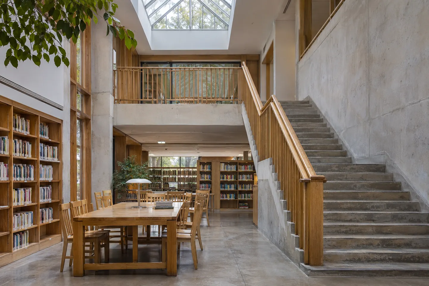
Space and material
Lead with an example story from an architecture commission. Follow with older sessions in date order.
Open the journalApply it to a sample brief
Compare an image-led grid with a dated story list. Use the architectural commission for a renovated library as the featured post and give two older stories visibly different thumbnails.
Build the page
Use a chronological list if freshness matters. Try a grid when visitors choose by thumbnail, or a featured story above a compact list when one story deserves extra space.
Compare two indexes
Use the same six posts in a dated list and a thumbnail grid. Include a long headline, an older story, and a post without an image. Ask a reader to find the older story by subject.
Choose a list or a grid
A dated list works when readers follow a series in order. A grid works when subjects are recognizable from the images. If the thumbnails look similar, keep visible titles and summaries so the grid is still easy to scan.
Check it before launch
Preview six posts with mixed title lengths and check that the reading order still makes sense with images turned off. Keep the version that makes the story easier to find. Check that each link still makes sense when read on its own.
Working in Showit
Compare the desktop and mobile views before publishing. Check whether the reading order, line breaks, and call to action still make sense when the layout is rearranged for a narrow screen.